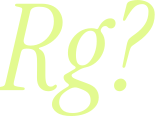
Image font finders work by comparing the shapes of letters in your picture with the shapes of fonts in their database. They are good at it, but only if you give them good letters. Most bad matches come from bad input, not from a bad tool. This guide walks through the whole process, from preparing the image to confirming the match.
1. Start with a clean crop
Font finders compare letter shapes, so give them good letters. Crop to one line of text, make it as large as you can and keep it straight. Five to ten characters with distinctive shapes, like a, g, R or Q, match far better than a whole paragraph.
- 01Crop to a single line of text.
- 02Rotate it so the baseline is level.
- 03Raise the contrast until the letters are dark on a light background.
- 04Remove anything touching the letters: underlines, icons, other words.
A few more things help:
- Size. Letters should be at least 50 to 100 pixels tall. If your image is small, zoom in before you take the screenshot rather than enlarging the screenshot afterwards.
- Perspective. Text photographed at an angle gets stretched. Most photo editors, including the ones built into phones, can correct perspective.
- Separate letters. If letters touch each other, finders often read two letters as one. Pick a word where they are clearly apart.
- Pick the right word. Lowercase letters carry more character than capitals. A word with a, g, e, R, Q or numbers like 2 and 7 gives a finder much more to work with than "TITLE".
2. Run it through a font finder
Upload the crop to an image font finder. Each one detects the letters, asks you to confirm or correct them, and returns a ranked list of close matches. Two that are well established:
- WhatTheFont, by MyFonts. You upload an image and it compares the letters against its font database. It also has free apps for iPhone and Android, so you can photograph text directly.
- WhatFontIs. It searches both commercial and free fonts, which helps when you want a free alternative. Its website describes a free plan with a daily limit and a paid plan.
When the finder asks you to confirm the letters, check every one. A single wrong letter, an l read as an I, is enough to send the search in the wrong direction.
Try more than one finder. Their databases differ: a finder built on a store's catalogue is strongest on the fonts that store sells, and may miss open source fonts entirely.
3. Check the match against the original
The top result is a suggestion, not an answer. Type your own text in the candidate font and compare the letters that differ most between typefaces: the tail of the g, the leg of the R, the width of the o. If two or three of those agree, you have it.
Things that look alike but are not the same font:
- Close relatives. Many fonts are revivals or remixes of the same historical design. Two versions of a classic serif can look identical in a headline and different in every detail.
- Weights and widths. The match may be the right family in the wrong weight. Compare stroke thickness, not just shapes.
- Custom lettering. Logos are often drawn by hand or edited from a font. If nothing matches exactly, the closest result may be the starting point the designer used.
If no finder gives you a good match, ask people. Type communities on Reddit and design forums identify fonts from images every day, and they are good at spotting customised lettering.
What to compare when you check a match
If you know what to look at, checking a match takes a minute. These details differ the most between typefaces:
- Terminals. The ends of strokes, on letters like a, c, f, r and t. Are they cut straight, angled, rounded or finished with a ball?
- The g. Some fonts use a two-storey g with a closed loop below, others a single-storey g. It is one of the quickest ways to rule fonts out.
- The R and K. Look at where the leg meets the bowl or stem, and whether the leg is straight or curved.
- x-height. How tall the lowercase letters are compared with the capitals. A font with a large x-height looks bigger at the same size.
- Contrast. The difference between thick and thin strokes. Geometric sans fonts have almost none; many serifs have a lot.
- Apertures. How open the gaps in letters like c, e and s are.
- Numbers. Numerals are often more distinctive than letters, especially 1, 2, 4, 7 and 9.
Compare the same characters at a large size. Small differences that disappear at body text size become obvious at 200 pixels.
Common mistakes
- Using the whole image. A full poster or web page confuses finders. Always crop.
- Mixing two fonts. Headlines and body text are often set in different fonts. Identify them one at a time.
- Trusting the top result. Finders rank by similarity, and the most similar font in their catalogue may not be the one used.
- Ignoring effects. Shadows, outlines and textures change letter shapes. Find a plain sample of the same text if you can.
Fonts in a PDF
If the text is in a PDF rather than an image, you may not need a finder at all. Many PDFs list the fonts they use. In Adobe Acrobat Reader, open File > Properties and look at the Fonts tab. The names may carry a prefix of random letters, like ABCDEF+FontName, which only means the font was subset; the part after the plus sign is the font's name.
4. Decide whether you need that exact font
Sometimes the exact font is commercial and expensive, and you only need the feel of it. Most finders show similar fonts alongside the match, and some, like WhatFontIs, show free alternatives. A good free alternative used well often serves the project better than a licence you cannot justify.
If you do want the exact font, buy it from the foundry or a reseller, and check that the licence covers how you will use it. Desktop use, website use and app use are usually separate licences. Our font licensing basics guide explains the differences.
If the text is on a website, skip the image
A screenshot throws away information the page already has. On a live website the browser knows exactly which font it rendered, so you can read the name instead of guessing from pixels.
Fontied lists every font on the page in one click, with the exact family, weight and style, and you can download the files or convert them for desktop apps. There is no matching and no guessing: if the browser drew it, Fontied lists it. See how it compares in Fontied vs WhatTheFont, and check the licence before you use a font you download.
Quick checklist
- 01Website? Use a tool that reads the page instead of an image.
- 02Image? Crop one line, straighten it, raise the contrast.
- 03Run it through two finders and confirm every letter.
- 04Compare distinctive letters by eye before you trust the result.
- 05Check the licence before you use the font.
Once you have the file, our guide to installing fonts on Mac and Windows gets it into your apps.
Questions
Can I find a font from a photo on my phone?
Yes. WhatTheFont has free apps for iPhone and Android that let you photograph text and see matching fonts. Crop tightly to one line before you search.
Why does the font finder give me the wrong font?
Usually because the image is too small, tilted or low in contrast, or because the text is a logo that was customised by hand. Crop, straighten and raise the contrast, then compare distinctive letters yourself.
What if the text is on a website?
Do not use an image at all. The browser knows exactly which font it drew, so a tool that reads the page, like Fontied, gives you the exact name and the file.